Difference between revisions of "Graph"
Jump to navigation
Jump to search
| Line 1: | Line 1: | ||
A Graph within LiveDC is used to show historical changes in your data. Fed by specified Data Series, a Graph will provide valuable insight into trends and expectations around what to expect in the case of an outage, disruption, and the future. | A Graph within LiveDC is used to show historical changes in your data. Fed by specified Data Series, a Graph will provide valuable insight into trends and expectations around what to expect in the case of an outage, disruption, and the future. | ||
| + | |||
| + | ==Table of Contents== | ||
| + | This section includes the following subsections: | ||
| + | *[[#Creating a Graph|Creating a Graph]] | ||
==Creating a Graph== | ==Creating a Graph== | ||
Revision as of 07:33, 14 July 2014
A Graph within LiveDC is used to show historical changes in your data. Fed by specified Data Series, a Graph will provide valuable insight into trends and expectations around what to expect in the case of an outage, disruption, and the future.
Table of Contents
This section includes the following subsections:
Creating a Graph
- On the navigation menu (left-hand side) click “Visuals” and then “Graphs” this will open a new tab titled “Graphs”
- Within the Graphs tab, in the upper left-hand corner click the “Create” button. A new window will open up called “Create Graph”
- Enter the name of the Graph in the “Name” field
- Examples: Server Changes, Temperatures (Hot Aisles), UPS Capacity, etc.
- Enter any additional information about the Graph in the “Details” field
- Enter a title in the “Title” field that be displayed when the Graph is generated
- Enter a label for the X-axis in the “Axis Label” field
- Examples: Temperature (F), kW, Month, etc.
- Select a size for the Graph in the “Size” drop-down menu
- Small, Medium, or Large - this will determine the detail and resolution of the graph when displayed
- Define a time period for the Graph to display in the “Time Period” section
- We usually look over the last month or last 3 months (previous quarter)
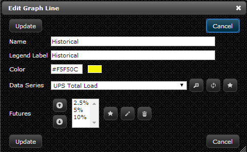
- Add Lines to the Graph by clicking on the star button to create a new “Graph Line” record. In the “Create Graph Line” window enter the following:
- Enter the name of the Line in the “Name” field
- Examples: Physical Servers, Average Temperature, Historical Power, etc.
- Enter a name for the legend of this Line in the “Legend Label” field
- Examples: Historical, Max Temp, Physical Servers, etc.
- This label will appear at the bottom of the graph along with the color of the line it is representing
- Select a color for the Graph Line in the “Color” section
- Select the “Data Series” that will provide the data for the Graph Line in the drop-down menu or create a new “Data Series” record by clicking the star button (See “Creating a Data Series” section for instructions)
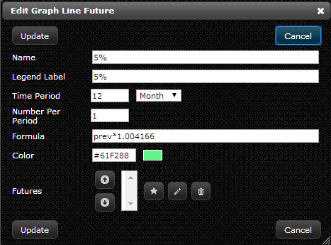
- Add a future line to show how the Graph Line could change in the future by clicking the star button to create a new “Futures” record. In the “Create Graph Line Future” window enter the following:
- Enter the name of the Graph Line Future in the “Name” field
- Example: 2.5%, 5%, 10%, etc.
- Enter a label for the Legend in the “Legend Label” field
- Example: 2.5%, 5%, 10%, etc.
- Define the period of time the Graph will extend into the future in the “Time Period” section
- Example: 24 months
- Enter the “Number Per Period” identifier which outlined how many times you want to provide a value each month as outlined in section 3 above.
- Example: 1 is the standard value here
- Enter a formula for the Future Graph Line in the “Formula” field
- See image below for syntax: prev*1.004166 refers to a 5% growth rate for the year, broken down to the monthly increase
- Define a color for the Future Graph Line in the “Color” field
- Click “Add”
- Click “Add” on the “Create Graph Line” window
- Click “Create” on the “Create Graph” window
- You now have a graph that will continue to update automatically and always be available for a real-time view in LiveDC

